Algomi ALFA – Modular UX for Fixed Income Trading
Connecting Bond Trading Efficiency with User-Centric Design (Algomi ALFA)
Role: Head of UX/UI
Company: Algomi (Fintech – Fixed Income Trading SaaS)
Duration: May 2017 – Nov 2018
Team: 1 product owner, 2 front-end devs, 1 QA, 1 visual designer (myself)
Tools: Sketch, Zeplin, InVision, Jira
Platform: Desktop SaaS (Electron + web components)
Target Users: Sell-side and buy-side fixed income traders
Business Challenge
Algomi’s ALFA platform aggregates data from multiple fixed income trading venues to give sales traders a clearer view of illiquid bond markets. But its fragmented UI and inconsistent workflows caused:
Slow decision-making
User drop-off during key tasks
Increased training costs for new traders
Goal: Improve usability and speed through a modular, intuitive, and customisable UX for power users — without disrupting existing workflows or data integrations.

Discovery & Constraints
Key Challenges:
Traders used multiple monitors and demanded real-time responsiveness.
Market behaviour changes rapidly — needed information density, not visual minimalism.
Many UX elements were hardcoded and rigid, making design scalability difficult.
Research:
Conducted contextual inquiry with 4 traders from buy- and sell-side desks.
Identified common frustrations:
“Too many clicks to get to what I care about.”
“I just want to build my dashboard, not follow your idea of one.”
“I need filters that don’t reset on every tab.”
Design Strategy
Contextual inquiry with traders from 3 desks
Uncovered pain points:
→ “Too many clicks to get to insights”
→ “Filters reset constantly”
→ “I want my own dashboard, not yours”

UX Strategy
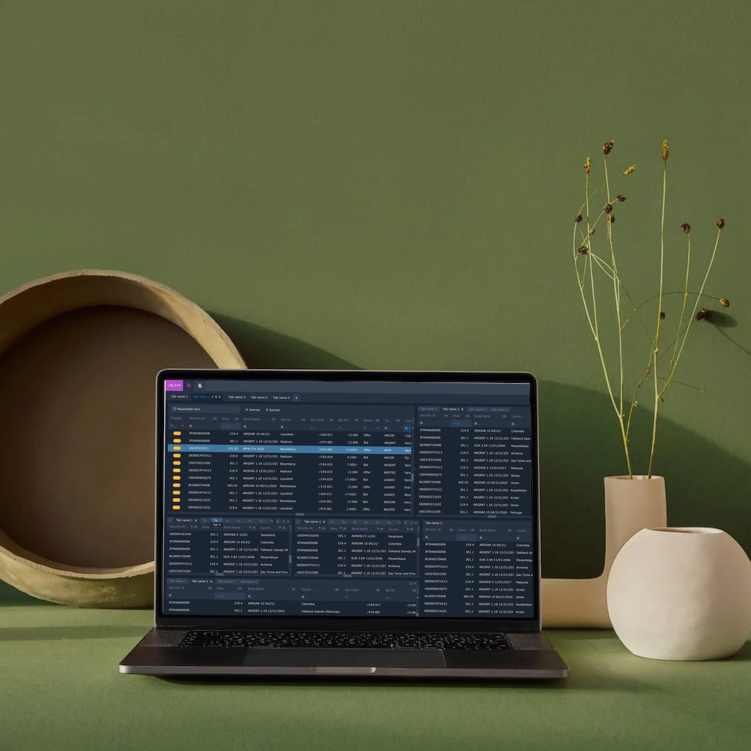
I introduced a modular UX framework:
Customisable widgets (drag, resize, dock)
Persistent multi-level filters
Keyboard-optimised navigation
Smart defaults for complex watchlists

Visual Design Approach
“Persistent filter column reduced re-entry friction for repeat queries.”
“Widgets could be repositioned and saved to suit trader preferences.”
“Layout adapted to multi-monitor environments common in trading desks.”


Outcomes
30% faster task completion in usability tests
25% reduction in onboarding time
Internal adoption by 3 trading desks within 2 months
Boosted product demos for sales teams
Reflections
“Next time I’d engage data engineering earlier to align interface limitations. But the modular system and real-time patterns proved essential in increasing trader trust and platform utility.”
Test – The Moment of Truth
This phase was critical to validate whether our solutions worked in the real world.
Exercises We Used:
Cognitive Walkthroughs: Traders performed tasks while narrating their thoughts aloud, revealing usability issues in real time.
Usability Testing: Testing core functionalities—search flow, bond comparisons, trade execution, and alerts.
Why These Exercises? We wanted immediate, honest feedback. The cognitive walkthroughs helped us uncover hidden frustrations, while usability testing ensured our designs worked seamlessly under real-world conditions.

What Could We Have Done Differently?
No story is perfect, and if we had a time machine, here’s what we’d tweak:
Earlier Involvement from Developers: Engaging developers from day one could have helped identify technical constraints early and smooth the transition from design to development.
Broader User Testing Early On: Testing with a wider variety of traders from different backgrounds might have uncovered niche pain points sooner.
More Iterative Prototyping: Faster feedback loops would have helped refine design elements more quickly and efficiently.
Increased Cross-Team Collaboration: Regular workshops with marketing and compliance teams could have surfaced additional user needs and requirements earlier in the process.